A founder with two stores and one budget.
The product only works with an audience, and the audience was on both platforms. Building natively twice would have consumed the entire runway before launch; picking one platform would have halved the audience the product depends on.
The design also had to be genuinely identical across both, because early users would be comparing notes with each other from day one.
One codebase, held to a single design.
Feeds, posting and profiles
The core loop built once — content in, content out, and identity around it — with room to iterate after launch.
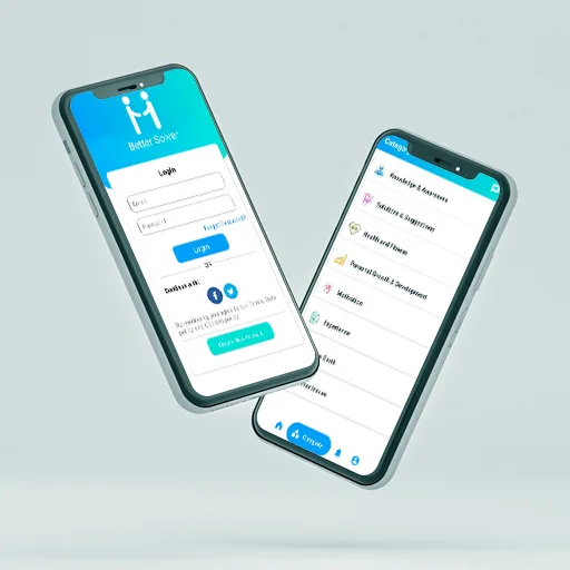
Identical design on both stores
Flutter’s rendering used deliberately so the two apps are the same product rather than two interpretations.
Simultaneous store releases
One release process producing both builds, so features land on both platforms the same week.
Performance on mid-range Android
Tuned against cheaper devices rather than flagship phones, since that is where the audience actually is.
Two calls that shaped the build.
Flutter, with eyes open
We were explicit about the trade: near-native feel and half the build cost, in exchange for occasional platform-specific work. For a pre-audience social product that trade is clearly worth taking.
A smaller launch scope
We cut features rather than platforms. Launching a narrower product on both stores beats a complete product on one, when the whole thesis depends on people talking to each other.
A launch that reached the whole audience.
- Both stores launched together, within the budget of a single native build.
- The app looks and behaves the same on either platform, so early feedback is comparable.
- Post-launch changes ship to both platforms in one cycle rather than two.
Client-reported outcomes, described qualitatively — we publish numbers only where the client has agreed to them.