Typical UX Mistakes to Avoid
Thu, 06 May 2021
Website UX encompasses a wide variety of variables but the human experience is what matters most. Your website must be the central focus of your digital marketing activities and allow them to purchase or at least subscribe. There’s a fair chance that a few fundamental UX problems will turn the metrics around.
I’d like to shed some light on a few signs below that the UX design of your device needs refreshment.
Are you losing money now and then?
The UX will make it easy for its user to search, browse related items, and pay as quickly and conveniently as possible. This undoubtedly leads to the inference that if sales fall, there are chances that your app or website itself might be standing in the way of transactions, rather than encouraging them.
Too many clicks
Difficulty in finding the shopping cart
Too many steps involved in selecting, purchasing and checking out
These are some of the most popular possibilities that might lead potential clients to bail before they hit the end. And you need to make sure that for consumers the whole process of making the purchase is a simple and enjoyable one.
Adequate Loss of Customer
Another significant factor is the decline in visitor numbers. Your app is uninstalled or you shut down the website at a fanatical pace. And holding it back becomes a big problem. Okay, it all depends on how well you communicate to your end-users the interest of your website. You must understand that visitors are visiting your site with a specific intent in mind, so if it does not deliver what they are looking for, they are more likely to break and may not return.
Easy, at the initial stage where fewer people are found installing your app, figure out the parts of your website are most entertaining and put them right in front of the end-user. Ask them for direct input, question them about interactions that have little or no presence, and delete it.
Focusing on Impressive Design
Everybody dreams of making an app or website that will make a huge splash in no time. Build a sensation by wowing the target audience, in clear terms. And you’re asking your web designer to come up with an amazing concept hoping your end-users are going to be blown away the way they look because you did.
Instead of concentrating on spectacular designs, websites integrate a functional architecture that provides simple, easy-to-understand resources for users. Even if you catch the users’ attention with the impact of wow, you will lose them with your unusable interface at the very next point.
What Makes A Great Website?
Without a doubt, UX seems to have been more granular. All are supposed to look balanced, adding only one unnecessary field can lead to a high bounce rate. What you have is to catch your visitor in less than one minute, so make the most of it.
Craft an inviting homepage
Speed matters the most (loading speed)
Give some legroom space
Effective Call to Action
Let the visuals speak – Images and Videos
Fix all the broken links
Get rid of unnecessary elements – improve the general look and feel
Apart from these consider these analytical components:
Bounce rate
User behavior
Search usage
Customer surveys
A/B testing
There are several other analytical elements, of course, but these are already useful for getting you on the road.
Final Word:
Surviving is not going to be easy in the online business world. It’s going to take too long to get on top of your game. Do not want to concentrate solely on technological aspects; the user experience may be ignored. Here’s a secret sauce to create an intuitive user interface that’s all about combining your product’s technical model with your audience’s mental model. When you have this done right, nothing will hinder you from succeeding.
POPULAR POSTS

Minimum Budget for Facebook Ads in India in 2025 – What Works
Tue, 20 Jan 2026
How PHP and Laravel Help Build Secure Websites | PHP Security
Tue, 20 Jan 2026
Wed, 07 Apr 2021

Why UX And UI Is Important For Mobile Application Development
Sat, 01 May 2021
The Difference between Digital Marketing and Advertising
Wed, 07 Apr 2021RECENT POSTS
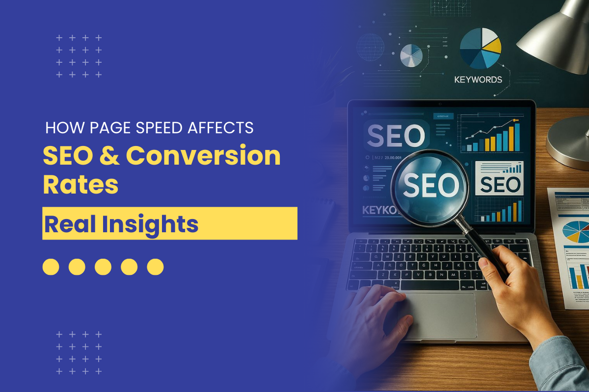
How Page Speed Affects SEO & Conversion Rates | Real Insights 2026
Tue, 27 Jan 2026
Website API Development: How to Boost Scalability & Functionality
Tue, 27 Jan 2026
Minimum Budget for Facebook Ads in India in 2025 – What Works
Tue, 20 Jan 2026
How PHP and Laravel Help Build Secure Websites | PHP Security
Tue, 20 Jan 2026
Why Every Business Needs a Mobile App Today – Simple Guide
Tue, 20 Jan 2026