The Importance of Color in Mobile App Design
Thu, 06 May 2021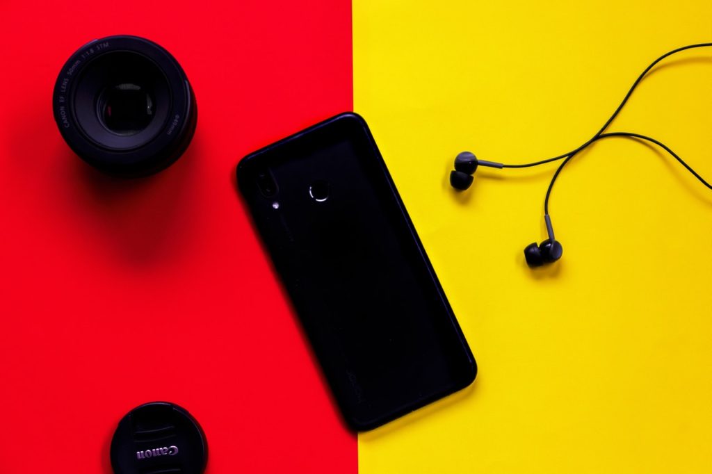
We are well acquainted with the fact that both user experience and user interface play a significant role when it comes to having more users interested. You can’t ignore the power of various colors in device design though. The truth is that the app designers will not only concentrate on making the app user friendly but also on selecting the correct proportion of shades for the interface design.
People will enjoy a vibrant and sexy app, which helps understand the quality of your app. You will choose the color for your device icon, the logo, the main colors, and most importantly, the color scheme.
The Significance of Various Important Colors
In most cases, app designers will follow the current app design trends when choosing colors, which is not a bad idea. Remember that each of the hues has an effect and power of contact with the user like;
If you use red, it would mean a call to action and would be more impulsive.
The yellow is tied to satisfaction and hope.
Green is related to nature and the environment and is connected to money and prosperity.
Orange stands for passion and anticipation.
Blue is another bright color renowned for wealth and serenity.
Choosing the Color for the Icon
If you visit the Google Play Store or the Apple App Store, you can see a multitude of colorful app icons.
So, your interpretation and experience of the hues come into play here. You have to make very careful choices. The potential way out is to follow current trends in design and then select dominant colors such as red, blue, or green.
If you’ve been studying extensively, you would have seen that blue is the most commonly used color used in common apps like Facebook, Twitter, LinkedIn, Google, Safari, etc. But if you want to look different from your device icon, then you can use the various shades of green.
Picking up the Right Color Scheme
You should be conscious that choosing the correct color scheme is also one of the crucial jobs you have in your hands. Thus, when you go out to make the option, various things, such as color associates of your area and brand colors, need to be taken into account.
What you need to do is select the basic colors to boost the UX. The basic colors look good to the eyes and at the same time, reading the contents is easier for the user.
You may take the aid of a color wheel that includes many predefined schemes when designing the color scheme, making the job simpler for the designers.
Some best idea for mobile app color
Minimal color usage with focused palettes
High contrast colors
Subtle colored shadows
Bright colored iconography
Confine choice of color to black, white, and grey
Conclusion
Other than focusing on different components of UI and UX architecture, you need to offer an equal accent on it. The right color decision is paramount and it must be finished with intense care. The color schemes and comparisons are used to advance the application structure. It can offer a champion reaction to your application in the market rivalry.
POPULAR POSTS

Minimum Budget for Facebook Ads in India in 2025 – What Works
Tue, 20 Jan 2026
How PHP and Laravel Help Build Secure Websites | PHP Security
Tue, 20 Jan 2026
Wed, 07 Apr 2021

Why UX And UI Is Important For Mobile Application Development
Sat, 01 May 2021
The Difference between Digital Marketing and Advertising
Wed, 07 Apr 2021RECENT POSTS

How Page Speed Affects SEO & Conversion Rates | Real Insights 2026
Tue, 27 Jan 2026
Website API Development: How to Boost Scalability & Functionality
Tue, 27 Jan 2026
Minimum Budget for Facebook Ads in India in 2025 – What Works
Tue, 20 Jan 2026
How PHP and Laravel Help Build Secure Websites | PHP Security
Tue, 20 Jan 2026
Why Every Business Needs a Mobile App Today – Simple Guide
Tue, 20 Jan 2026