How to Create a Perfect Icon for App Store
Fri, 07 May 2021
Your icon is the face of the app, and your company name in many instances. All of your hard work and hours of creation come down to a tiny square. Creating an impressive icon is known as the best thing you can do to improve the app store (ASO). With over half a million applications on both the iTunes Store and the Google Play Store, users have less and less time to determine whether to download the app or not. Customers download the apps through the app stores, and to make the first impression of your app on users is your app icon and not what the app does.
It makes it important for your marketing app campaign, along with the fact that you’re likely to use the icon in a lot of online and mobile locations. Getting a unique app icon the sticks out doesn’t automatically mean you’re going to get thousands of downloads or your app is very amazing. But a revolutionary app icon will help get interested users to go deeper into your app, read your product summary and screenshots and eventually download and start using your mobile app.
How to create an awesome mobile app icon
Make Your Mobile App Unique so it stands Out – One of the icon’s key functions remains to distinguish yourself and get the user to tap on your app over others.
Do Not Be Afraid To Change Things – Do not make big changes to the design of your app but simply subtle ones that show that your app is constantly updated with improvements and features.
Branding Your Icon – If you have a clear feeling for the brand then easy branding is a perfect way to go. Keep it easy, but never forget. Top brands themselves are easy to scan for and don’t need engaging app icons because the company’s reputation is greater than the app.
Try Brand piggybacking – Successful brands have built their identities into which app consumers lock-in and interact again and again. If brand piggy-backing is done correctly, then app searchers can connect with your app because it is sufficiently similar to get attention and forge a connection with a niche identity that they want to be part of.
Key points
Do not use words
Keep it simple
Do not make your logo transparent
Do not make your icon glossy
Design with details
Make your icon consistent with your app so that your users remember you
Conclusion
Your App Store / Play Store icon is a cog of your business that matters. It is a small window of opportunity that you need to catch the attention of users in the App Store and persuade them that your screenshots, advertising video, explanation and finally installing your app are all worth it. What makes an excellent or poorly built App Store symbol, there is no willing formula for that. What’s crucial is that you are generating enough excitement to stand out initially. Your app icon will represent the offer of your items, and potential changes and improvements to the app icons can be made. We at softieons technology work on mobile app development and help the customers in the growth of their business according to their needs.
POPULAR POSTS

Shopify vs. WordPress: Which one is best for e-commerce?
Wed, 07 Apr 2021
Role of IoT in the Real Estate Industry
Wed, 14 Apr 2021
Why UX And UI Is Important For Mobile Application Development
Sat, 01 May 2021
Telemedicine's Advantages in Nursing Homes
Fri, 24 Dec 2021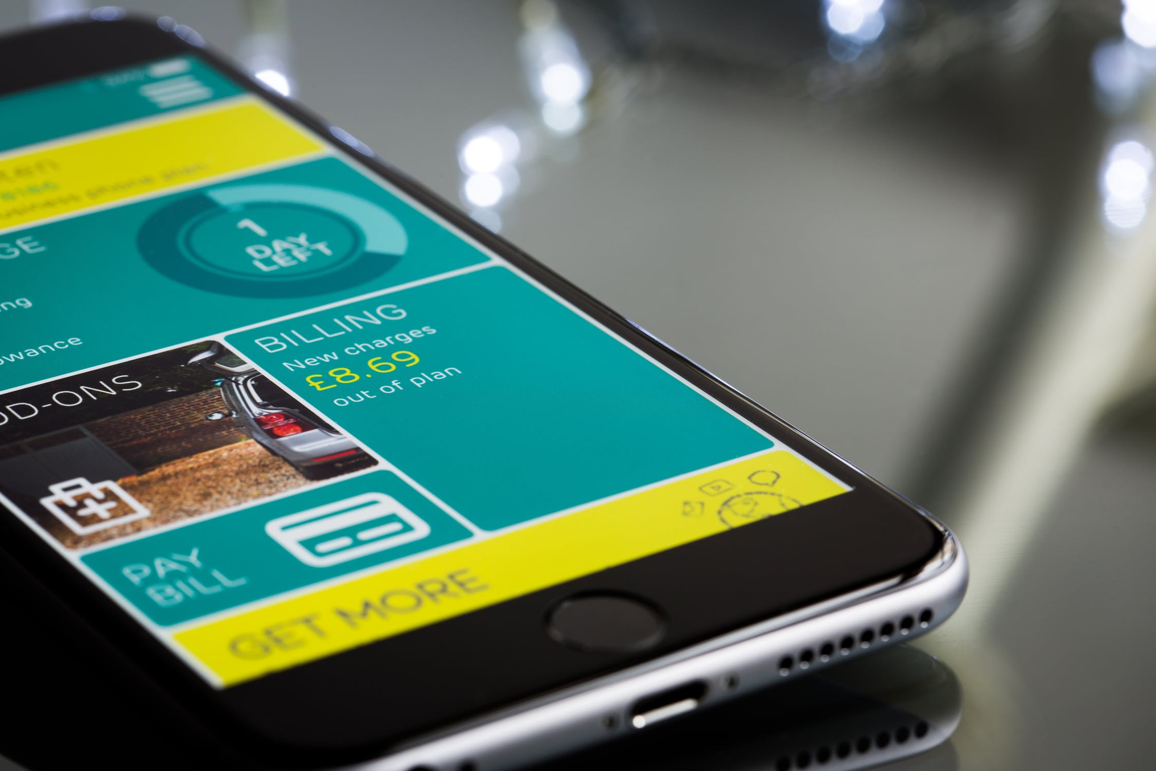
Fri, 24 Dec 2021
RECENT POSTS

Flutter vs. React Native: Which One to Choose in 2024?
Mon, 22 Apr 2024
Exploring the Benefits of Professional Website Design Companies
Fri, 29 Mar 2024
Understanding The Role Of Web Design Firms
Fri, 22 Mar 2024

5 Benefits Of Using Angular For Your Web Development
Tue, 05 Mar 2024